
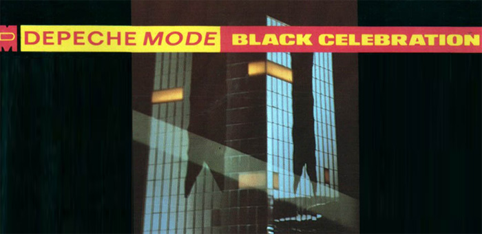
The artwork for Black Celebration is something special. It's dark yes, but it's somehow optimistic in tone too. The imperious and somewhat threatening building merges with the cheerier image of tulips which all sits together rather nicely. The logos, embossed on the cover of the album, look odd at first, but make sense when you look at the inner sleeve where each one appears beside a song. They obviously don't make sense in the sense that they match the lyrics (a birthday cake with Sometimes for example) but I'm sure that somewhere a Depeche fan has managed to work out the meaning of each icon relative to its track. That's the sort of thing that happens. Anyway, given that this month is all about a forensic dissection of all things black and celebratory, just so you know, here are the icon and song combinations from the inner sleeve:

Black Celebration - V for Victory in a circle is the best I can come up with for that
Fly On The Windscreen - Final - An Olympic Torch
A Question Of Lust - a DM logo
Sometimes - A birthday cake
It Doesn't Matter Two - Three bells in a row like you'd find on a fruit machine
A Question Of Time - An arrow pointing to an explosion? I have no idea
Stripped - A megaphone in a triangle with an arrow coming out of the megaphone. The arrow is no doubt there to indicate sound coming out of the megaphone BUT...and bear with me here....Music For The Masses has the big orange megaphone motif and one part of the Stripped megaphone (below) could easily be detached to form the MFTM megaphone and, if it was, you COULD argue that the arrow is pointing towards Music For The Masses and the artwork used for that was a reference to this very icon.

Of course that is absolute nonsense of the first order. Anyway...
Here Is The House - three trumpets in a vertical stack
World Full Of Nothing - three planes flying in an extremely dangerous formation
Dressed In Black - a Christmas cracker exploding
New Dress - Three flags in a circle, two orange, one clear
So there you go. Now, those symbols don't appear on the cover in the order the tracks run. No - that would be too easy. Again, only because I've come this far and feel some sort of obligation, the order of the icons on the cover is:
Left hand side - Three trumpets, V for Victory, Three Flags, Olympic Torch, Exploding Cracker
Right hand side - Arrow pointing to explosion, Birthday Cake, Dangerous Planes, Fruit Machine, Megaphone
Now THAT would make the record running order:
Side 1 - Here Is The House, Black Celebration, New Dress, Fly On The Windscreen - Final, Dressed In Black
Side 2 - A Question Of Time, Sometimes, World Full Of Nothing, It Doesn't Matter Two, Stripped
No A Question Of Lust? Well that logo, the DM one, appears at the top left of the sleeve beside the words Depeche Mode Black Celebration so in this increasingly bizarre world I've created, perhaps that should be track one. Who knows? By this point, I'm starting to confuse myself. Is the running order above a better running order than the actual album? No. Of course not. Enough of this madness.
HANG ON THOUGH! On the alternative running order, Stripped is last. The megaphone arrow pointing to the future. To Music For The Masses and its megaphone. Yes? No? Probably no. Definitely no.
As the above shows, I am in no way qualified to talk about Black Celebration's artwork. One man who is though is Brian Griffin who, having created the beautiful, iconic artwork for Speak & Spell, A Broken Frame, Construction Time Again and Some Great Reward, was initially asked to come up with a design for the cover. This matter is covered in detail on the Black Celebration re-issue DVD where Brian and Martyn Atkins of T&CP Associates discuss it in depth. Brian however agreed to answer a few supplementary questions for me which was very kind.
Martyn Atkins had spoken to Daniel Miller about doing something involving buildings and flags, giving an imposing feel. Brian Griffin was asked to do the photography and so he came up with a concept where he built a 1930's futurist style building with flags draped down the side of it. That was then photographed and the original artwork concept looks like this:

That was rejected however as, according to the DVD, the band and Martyn didn't like it, so the picture was cropped and trimmed and we ended up with the cover we all now know. Brian wasn't a fan though, as his interview on the DVD shows. It's safe to say that he still feels the same.
 |
| Brian Griffin |
APA: When you were first approached about Black Celebration, was there a particular concept you were asked to work to?
BG: I think Martyn Atkins, the designer, could probably better answer that more clearly. I think it was a tall corporate building draped with a flag
APA: Did you hear any of the album before starting work? If so, is that the usual thing when preparing an album sleeve so that the music informs the work? I imagine that was the case with Construction Time again for example.
BG: You were generally given a cassette tape. I never thoroughly listened to the music for any band I shot for as I was most interested in making a powerful image. The band would generally supply you with a thorough understanding of the main motivations behind the album
APA: The artwork seemed to change from your original concept to the final sleeve we all know. How did that come about?
BG: The album cover looks like I was distracted in some way. Martyn Atkins was starting to dictate things creatively which I disagreed with, so I lost focus. I liked him as a person but did not respect him as a designer. Not a happy working relationship, so hence this was my last cover for DM.
APA: Ultimately, what are your thoughts on the Black Celebration artwork? Where does it rank for you in your own Depeche involvement?
BG: I think the cover looks ok, but it's the one I don't have much time for. It displays an erosion in working relationships after doing two great covers with A Broken Frame and Construction Time Again. Such a pity!
Thanks very much to Brian for taking the time to chat to me. I imagine that, like me, you love his work for Depeche Mode, so you really must go and check out his website where you can see all his Depeche work, including outtakes and his suggested Construction Time Again which is rather wonderful. Go here http://www.briangriffin.co.uk/photography/album-covers/depeche-mode and see for yourself.
So what are the conclusions we can draw here? Well, other than I need to spend more time doing things other than interpreting Depeche Mode logos, not much. You might like the artwork, you might not. The band do, Brian doesn't. It's all in the eye of the beholder I guess.
Still, that Stripped icon theory is interesting isn't it?
Wait, that C< symbol is for "victory"?! That makes total sense in the light of the Churchill "brief moment of rejoicing" thing, actually. Wow, you're never too old to learn, I guess.
ReplyDeleteI always thought the "Victory" symbol was a medallion, with a ribbon.
ReplyDeleteBrilliant cover, in my opinion. Brian is probably just sour grapes, and understandably so. Too bad, as Anton Corbijn turned Depeche's covers into rotten crap. Great photographer, but he is no graphics designer. DM became a bore (artwork and musically) with Corbijn as their sidekick.
BTW, Sire actually got something right, for a change. They made the wiser decision of leaving out the symbols on the CD cover.